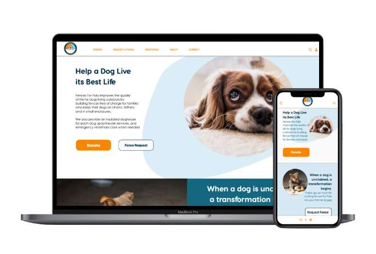
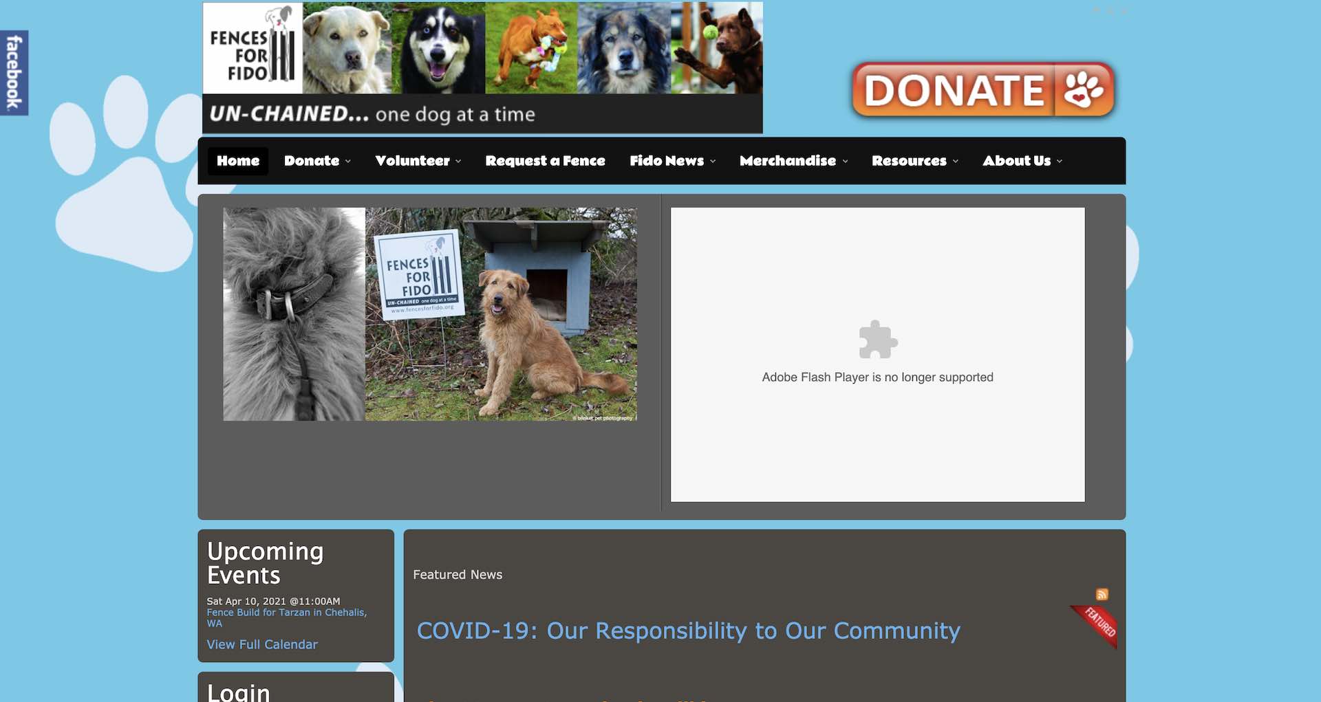
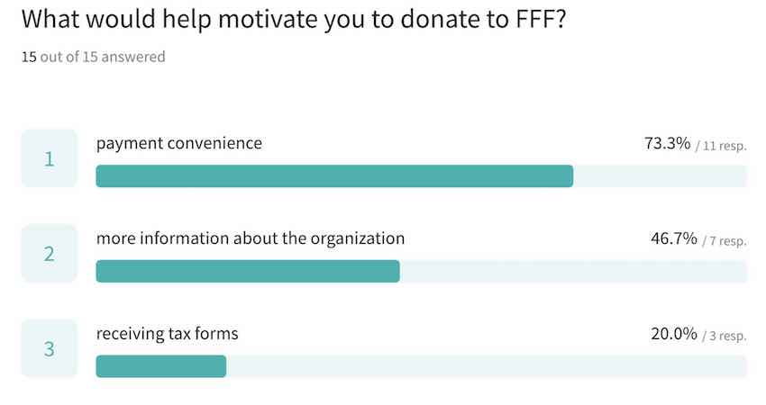
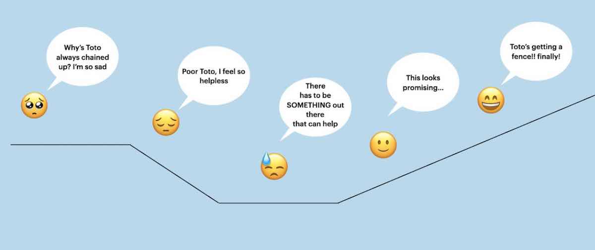
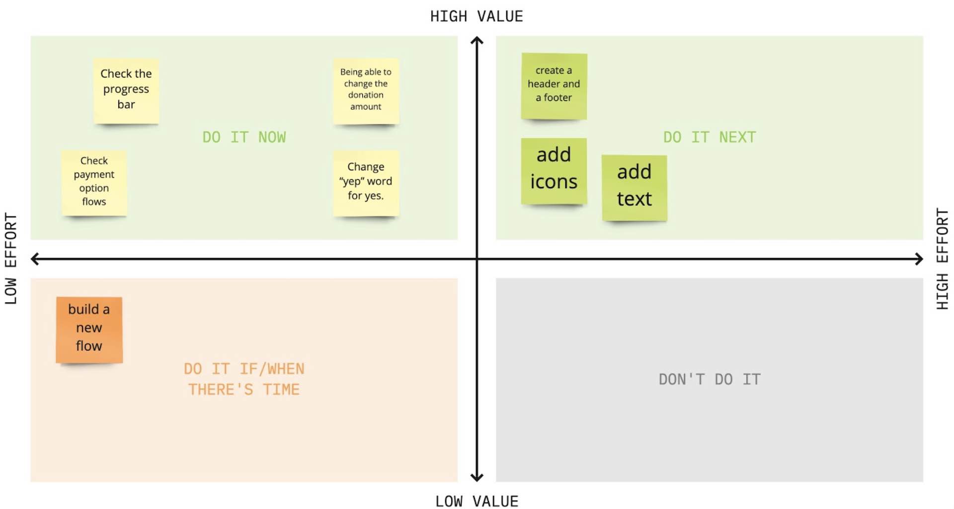
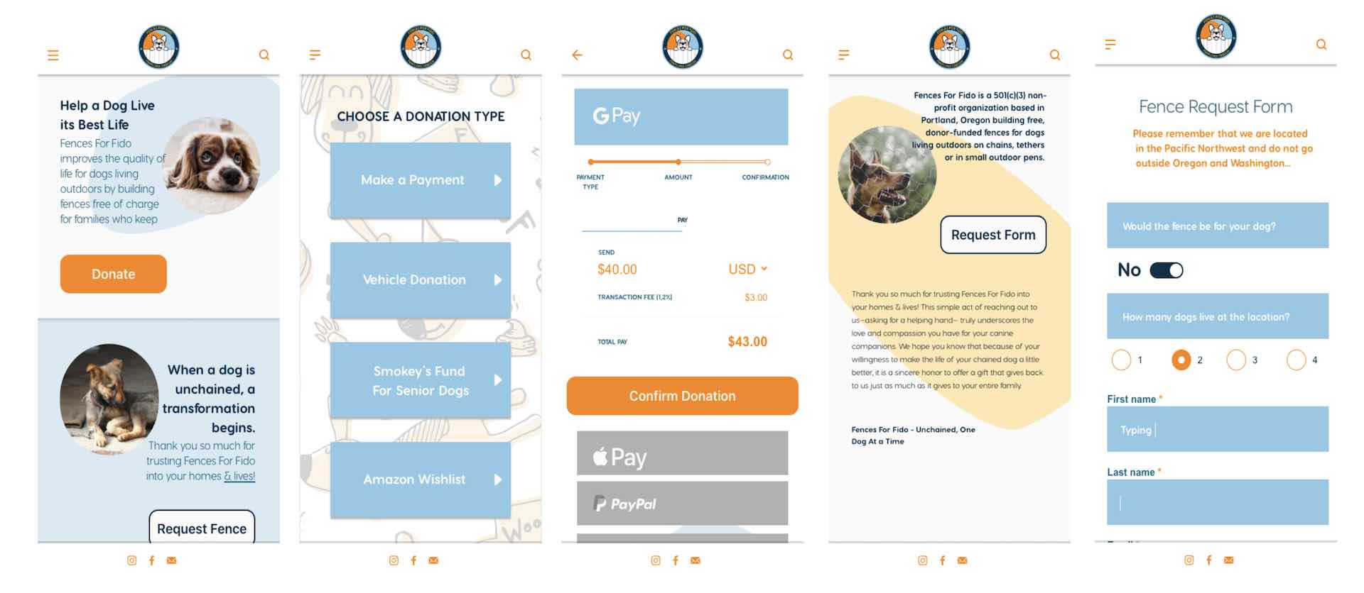
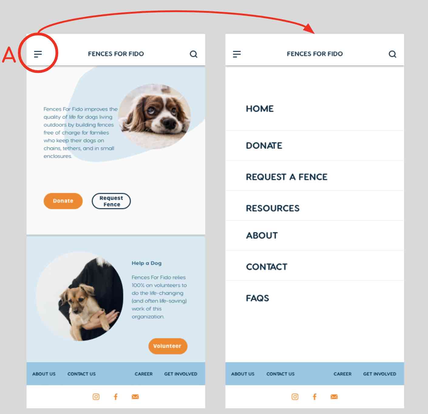
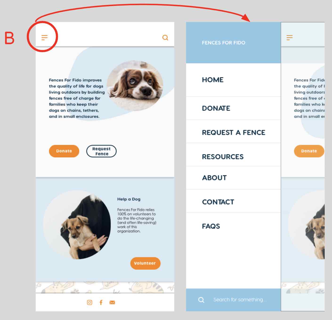
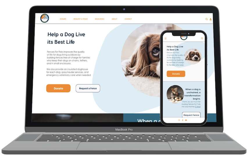
Problem: The Fences for Fido’s website is outdated and lacks a clear, cohesive mission
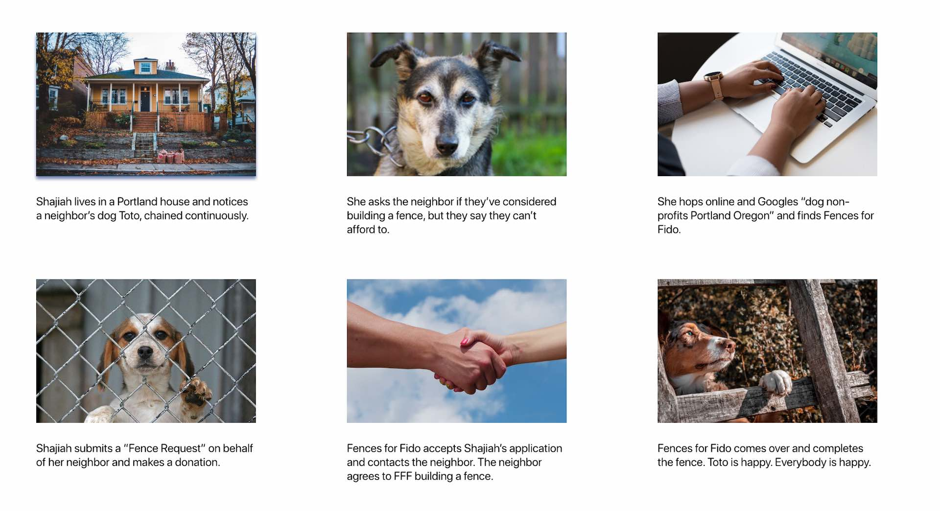
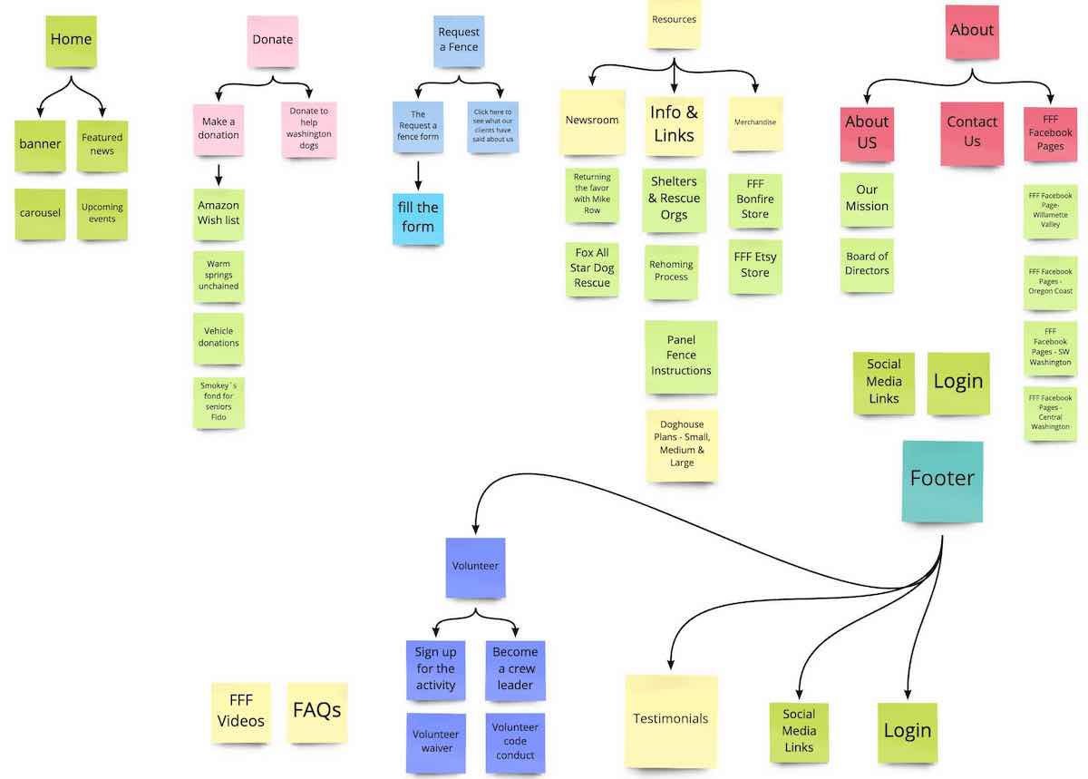
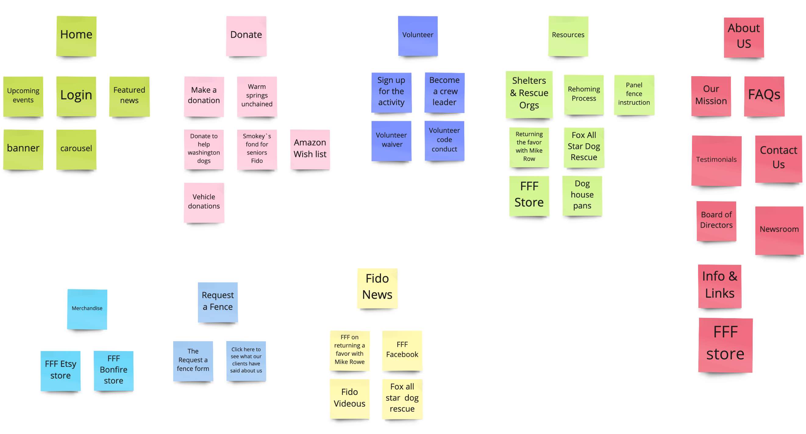
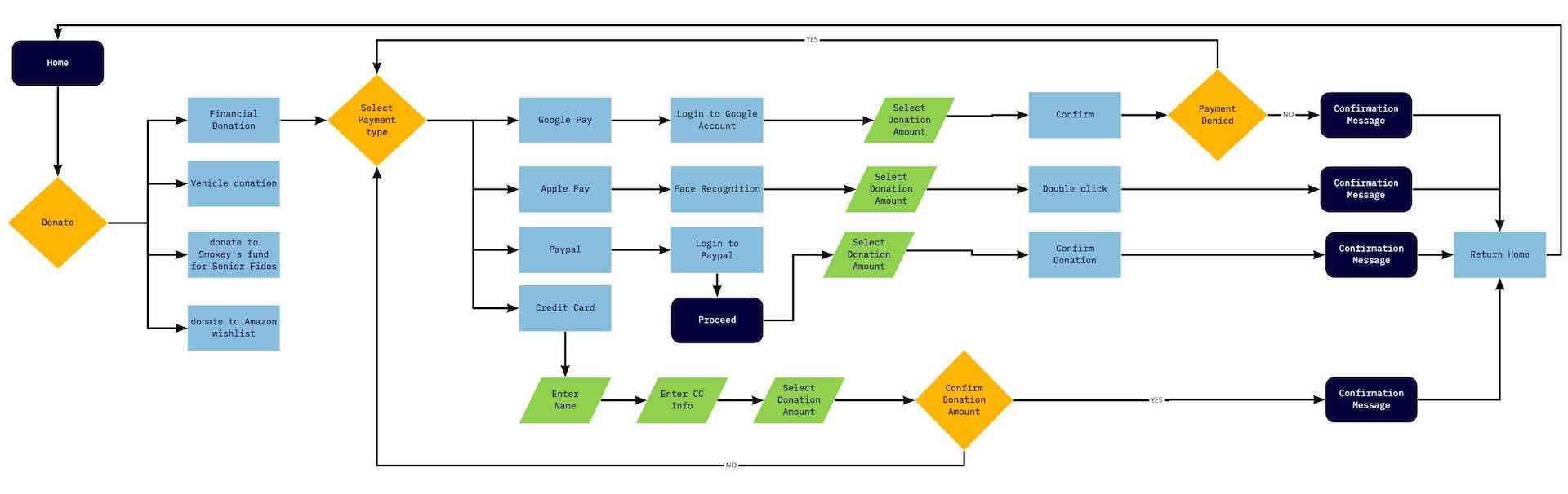
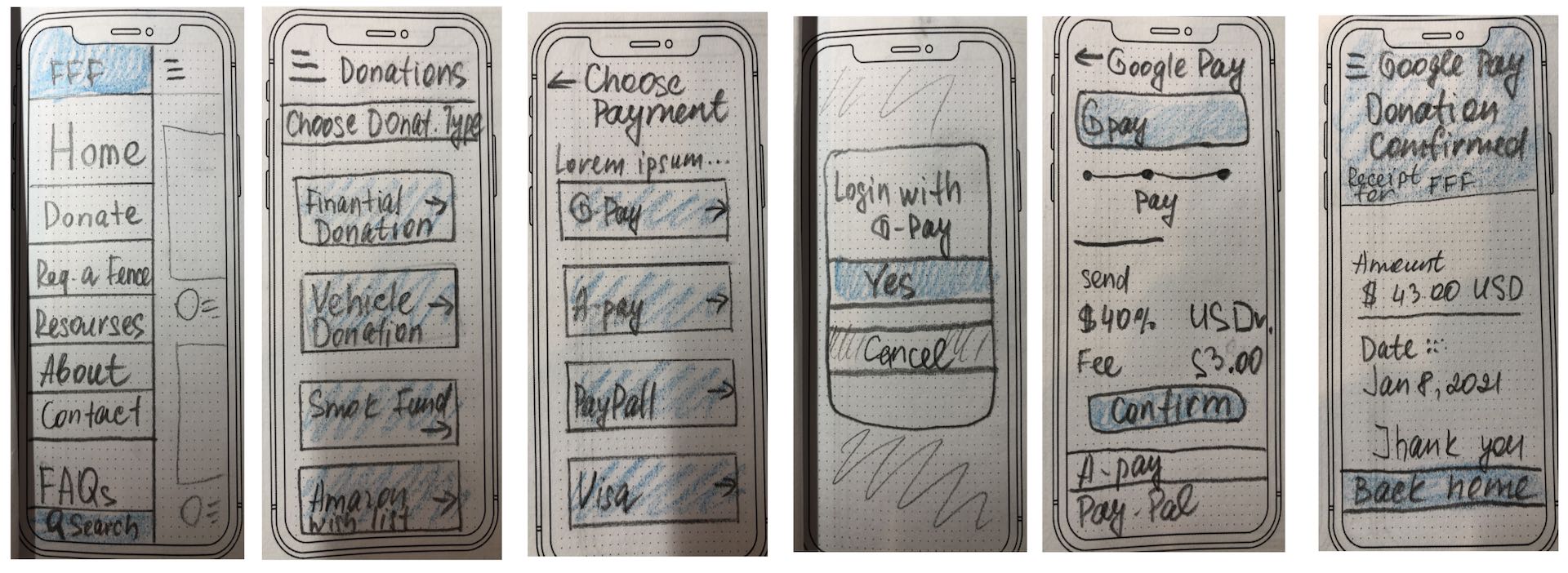
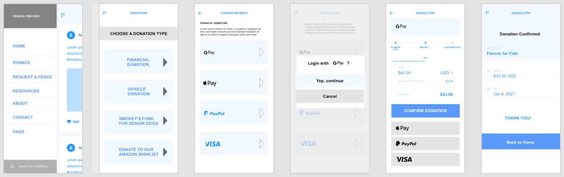
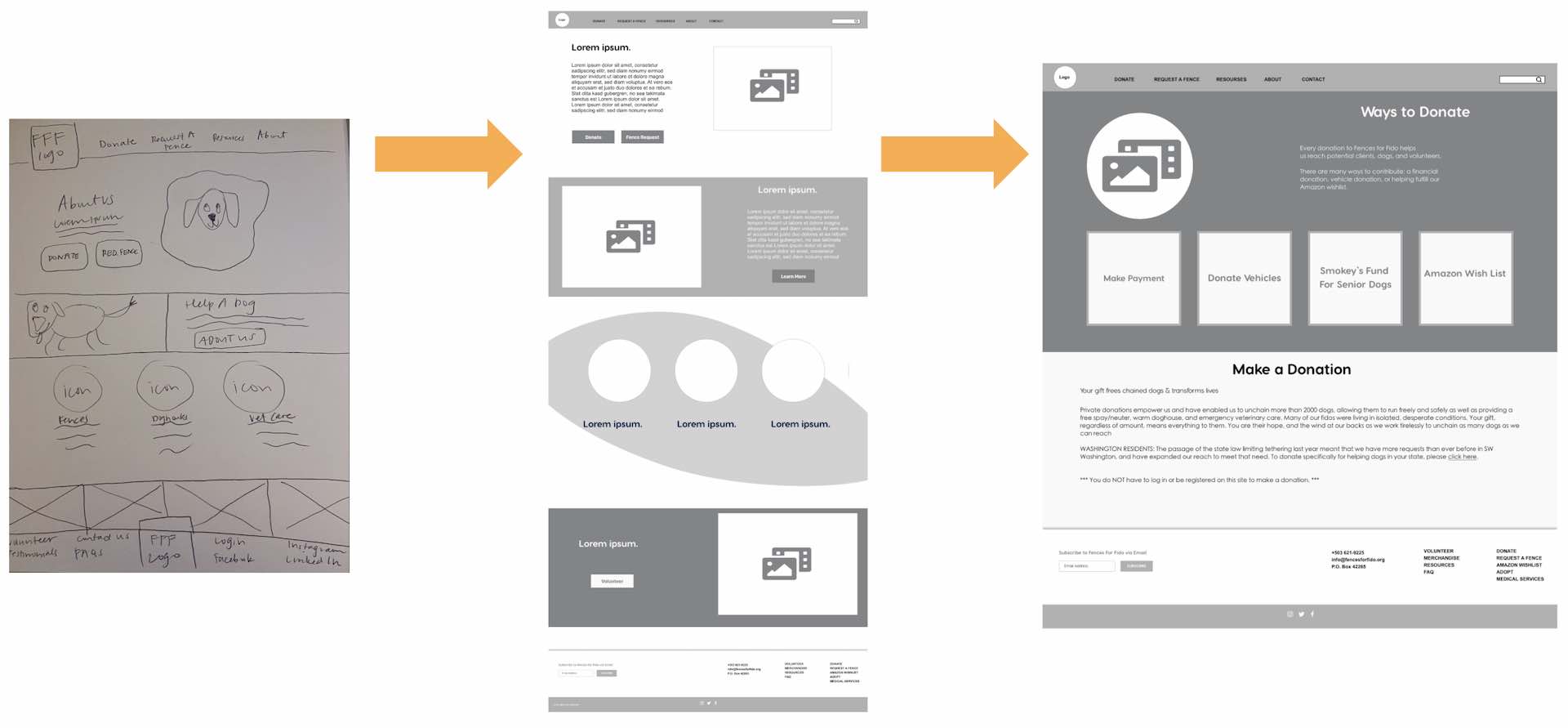
Solution: To redesign the website and a navigation in a minimalistic and modern way to help users in completing essential tasks, e.g. making donation and fence request
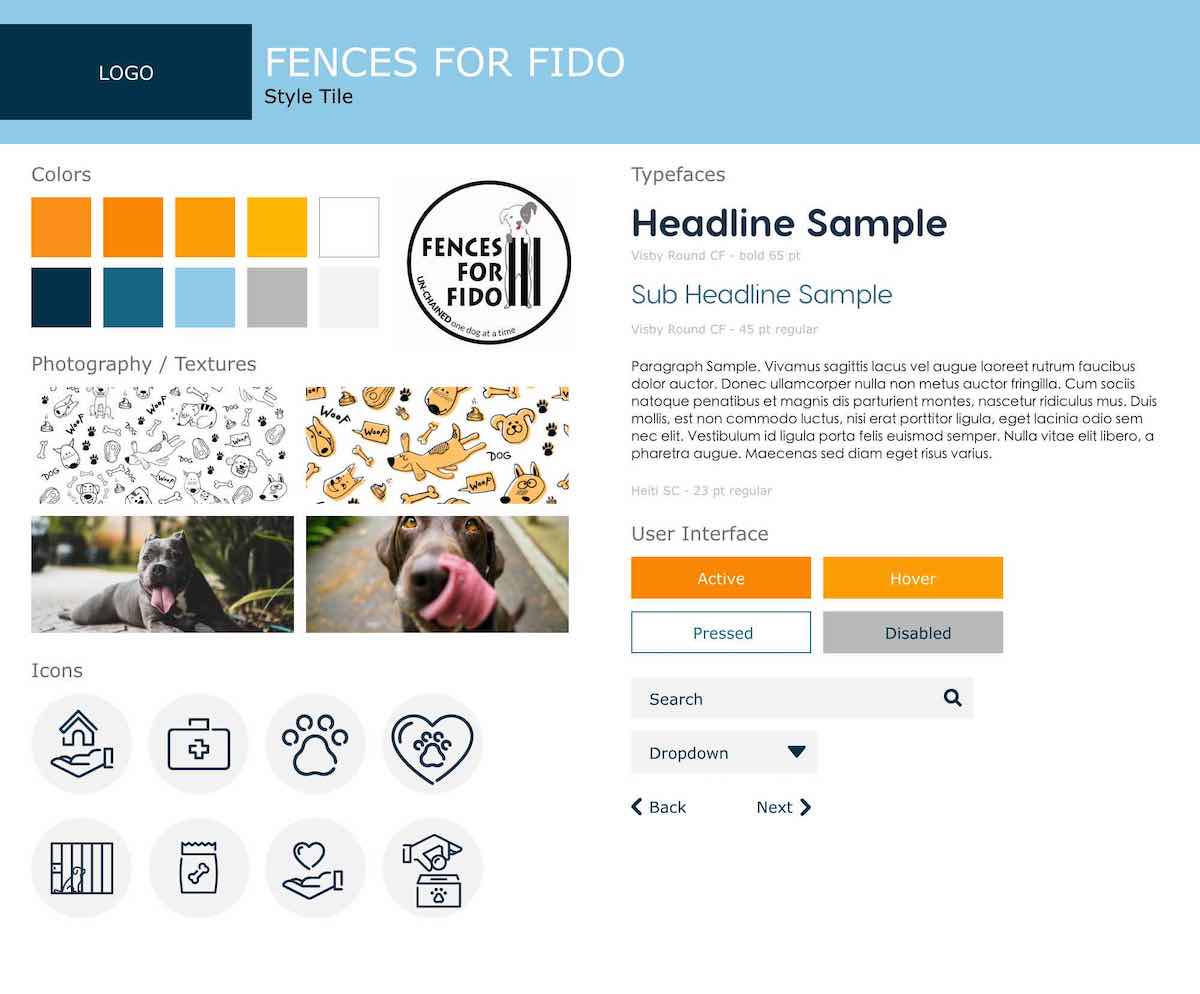
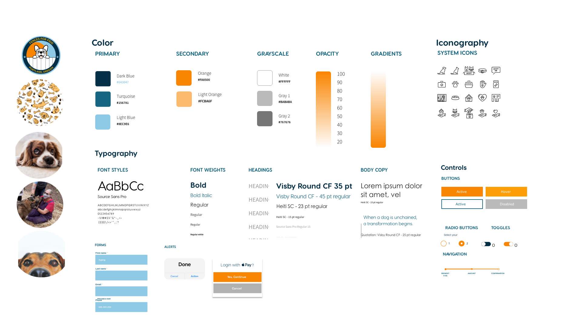
Tools: Miro | Figma | Adobe Illustrator | Adobe XD | Google Workspace
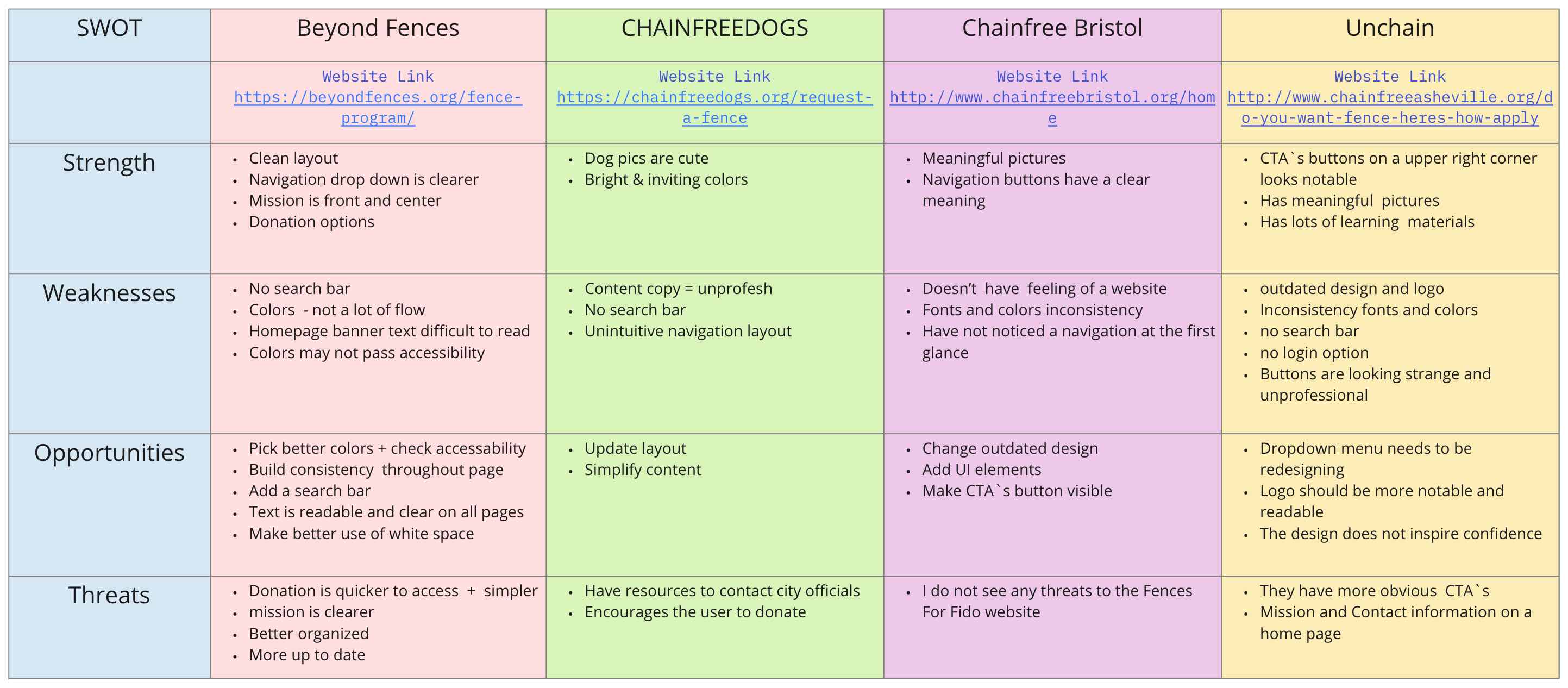
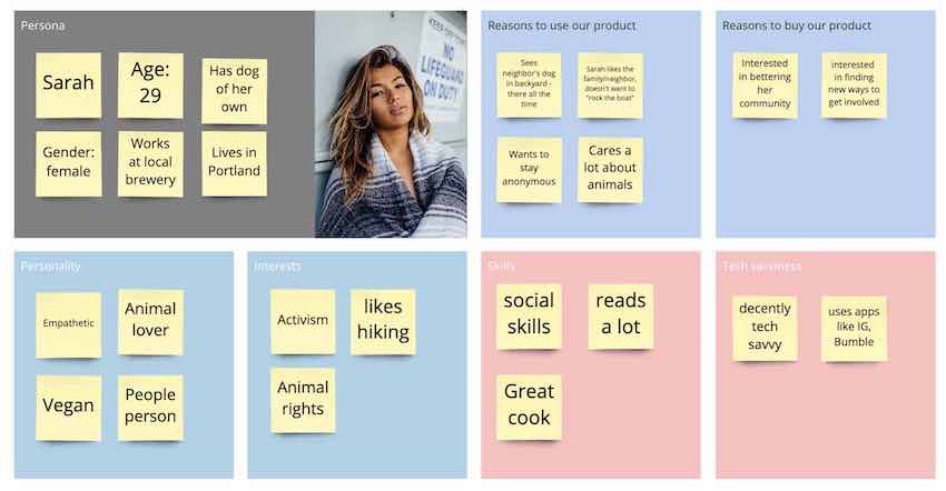
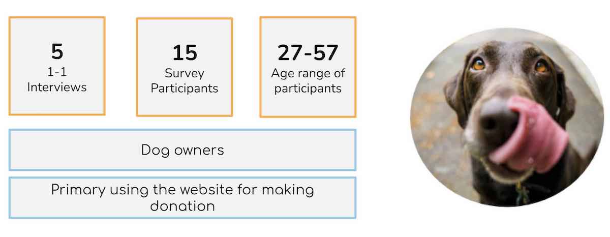
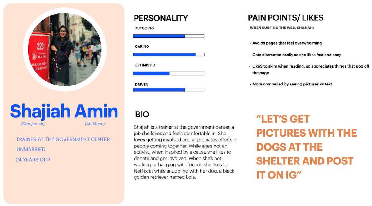
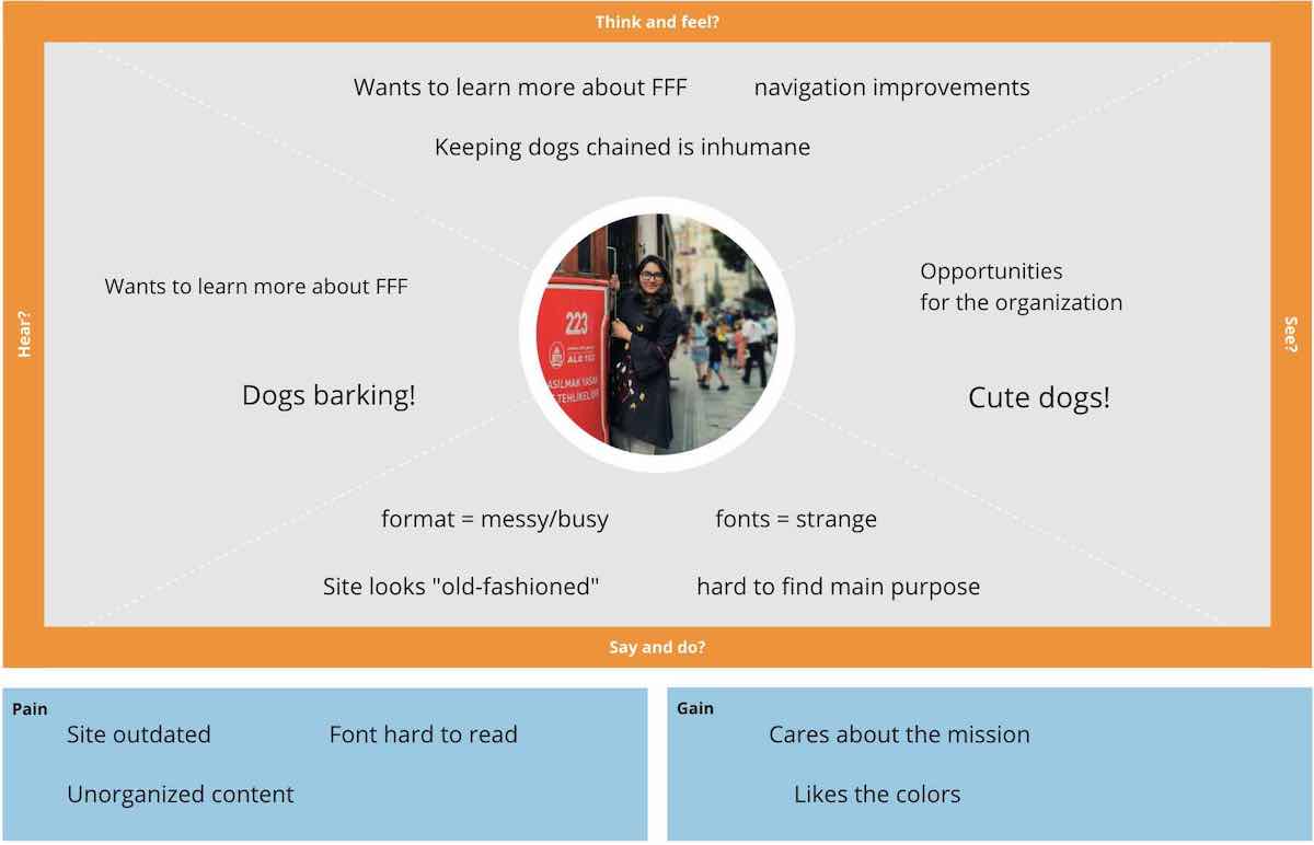
My Responsibilities: User Research Plan, Problem Statement, User Statement, Value Proposition Statement, Competitor Analysis, Flow Chart Lo-Fi - Hi-Fi prototyping and Testing
Timeline: 3 weeks - group project
The heuristic evaluation showed:
Affinity Diagram and “I like I wish What if” method helped us to prioritize and improve the main features:
Key Findings:
Shajiah is passionate about dogs and willing to make a donation to Fences for Fido. She also wants to request a fence for a neighbor who has a dog chained up outside.
How might we redesign the FFF website to help Shajiah have a seamless, efficient experience navigating the website and achieving her goals.
The Fences for Fido website's content is not optimal to support the organization's business goals: increasing the number donations, volunteers, fence/care requests while raising general brand awareness.
In particular the Make a Donation, Volunteers Sign-Up, and Fence Request features of the website do not contain a clear call to action. Added to that, the design of the features does not promote trust. All of this results in the mediocre conversion rate.
To support the FFF mission in improving the overall quality of life for dogs living outdoors, the new design aims at optimizing user’s experience, driving online donations, volunteer signups, merch sales, and face/care requests while increasing brand awareness.
Considering all previous work we built mobile paper prototype first and then went to Lo-Fi prototype where we decided to show the Donation Flow. The main goal was to give user a good choice of payment options.
Also, we wanted to create fast, convenient and trust-forming experience.
Learnings:
Lo-Fi testing led to the next iteration:
After that we came up with Hi-Fi Mobile prototype where two flows were built.
Than we came up with two different navigation designs and desided to conduct A/B testing
Performance of test B was on 25% higher than Test A.
Plan for the nex iteration:
Iterations were implemented in Hi-fi Mobile and Desktop Prototypes
Plans for future iterations:
What we have learned: