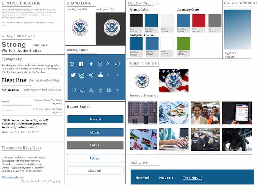
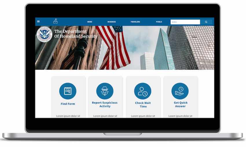
Redesign of a Government Agency Website - The Department of Homeland Security

Project Overview

Problem: An enormous amount of information makes it difficult to use and navigate around the website.

Solution: Redesign the website navigation in a minimalistic and modern way to help users simplify the information search.

Tools: Miro | Figma | Adobe Illustrator | Adobe XD | Microsoft Excel | Google Workspace

Timeline: 5 weeks - individual project

My Role: As a UI designer, my role is to redesign website navigation, develop a brand style guide and applied UI elements in a high-fidelity clickable prototype.

Heuristic Evaluation

    Heuristic Evaluation showed:
  • Overwhelming amount of information on a website can get users lost
  • Some inconsistency in fonts and colors
  • Buttons and links should be revised and reduced
  • Content and abbreviation needs to be more clear
  • Images can be more meaningful
...

Proto Persona

...

User Path

Alex currently has his L-1 visa, he is visiting the DHS website to learn about his green card eligibility with hopes to live, work and rase kids in the United States.

...

Redlining

...

Redlining

...

Website Testing

...

OBJECTIVE: Learn more information about obtaining a Green Card while being in the USA on a L-1 Work Visa

TASK 1: Find the “Get a Green Card” section of the website

TASK 2: Figure out how an "Immigrant Worker" would navigate to and find information on "How to Apply" and check eligibility requirements for a green card

Six User Testings gave the next results:

33% of users successfully completed the first task

66% of users partially completed the first task

100% of users successfully completed the second task

Empathy Map

  • At the first glance DHS Website serves as a news source
  • Double search bar is confusing
  • Hard to navigate
  • Easy to get lost on a Website
...

Heuristic Evaluation of the Website`s Navigation

...

Navigation Testing

...

OBJECTIVE: Discover users pain points on a website navigation

Question 1: Do the menu choices guide you as quickly as possible to your expected destination? Are there too many or too few options? Are they readable?

Question 2: Does the navigation design (tabs, mega menus, accordions, carousels, etc.) help you to find and discover what you need?

Question 3: Are there too many paths to get to a specific part of the website? Do you confuse, not knowing where to start?

Results: Users found it not easy to navigate and were confused about not being able to complete tasks

2x2 Matrix For Desktop

...

2x2 Matrix For Mobile

...

Card Sorting

...

Site Map

On a Site Map the primary navigation has been changed. Also, sub-topics of each navigation were changed for more relevant. The footer was rebuilt in more minimalistic way.

...

Iterated Site Map

After iterations, "about us" section moved to the primary navigation. Secondary navigation was sorted according Alphabetic order (LATCH Principles). Tertiary navigation was priotited by importance. "About us" was duplicated on the footer.

...

Prototype a New Navigation UI Based on the Sitemap Redesign

    While building a lo-fi prototype, I have tried to:

  • Make a clarity in titles
  • Reduce user steps
  • Fix search button
  • Reorganize information
  • Find the most sutable place for a social media links
...
...
...

Brand Voice

"Strong", "Rational", "Worldly", "Authorative" four adjectives were identified that would be set the direction in the design and form a single picture of agency brand recognition.

...
...

UI Style Tile

The original Homeland Security website has blue as a primary color. For the redesign, I decided to keep the primary colors to maintain consistency with websites of other Homeland Security departments.

For the same reason, typography remains a classic way.

...

Header & Footer Design

  • Header and Footer simple and understandable for users.
  • Each link has hover state.
  • The hamburger menu is a continuation of the header menu
... ...

Desktop Hamburger Navigation

...
  • Cards help users to orient quickly.
  • Menu is simple and has only two levels.
  • Clean interface.
  • Main menu helps to navigate to any page in 2-3 clicks.

Mobile Hamburger Navigation

...
...
  • Mobile-first design was apply for main menu.
  • Navigation is simple and has only two levels.
  • Clean interface

Five-Second Usability Test

OBJECTIVE: Discover users pain points on a website navigation

Question 1: How would you can find a Press Releases Page?

Results:
83% users completed Step 1 (click “News” button)
100% completed Step 2 (click “Releases” button )

Question 2: How would you find a "Green Card" Section?

Results:
71% users completed Step 1 (click “Public” )
80% completed Step 2 (click “Become Citizen”button)
100% completed Step 3 (click “Green Card” button)

...

2x2 Matrix For Desktop after Navigation Testing

...

Prototype Iterations

  • Logo and the agency name were added
  • Search button was changed
  • Added Fix position when scrolling
  • Fixed alignment and typos
...

Style Guide Tile

...

Color: As a primary colors I decided to use Dark Blue #0E5C8C, Light Blue #306F9D and a White Blue#F1F2F3. Secondary colors are Red #BE1826 and Green #629424. Also white, black and couple shades of grey color were added to design pallet.

Typography: Remains classic because a government agency website should give the impression of being formal, authoritative, and reliable. Therefore, I chose the font Merriweather 40 pt for Header 1, the Meriweather Bold Italic 20pt font for Header2. In my opinion, this will help to highlight the essential points in the text and make it stand out. For the body text, I decided to use the Source Sans Pro 20 pt font. There are no serifs in the font, so it will help users quickly and easily read and digest a massive amount of information on a website.

Iconography: Iconography is a standard set of symbols that will help guide users in the right direction and help them take the desired action.

Controls: For the user’s control, I developed four different button states which indicate possible users’ interactions. Among them, Normal, Active, Hover, and Disabled. I also did tabs with active and inactive states, checkboxes, toggles, progress bars, alerts, forms, and dropdown menus. By using controls, users will interact with the system faster and productive.

High Fidelity Desktop, Tablet and Mobile Prototype

Mobile and Desktop Homepage prototype and navigation testing

OBJECTIVE: Discover users roadblocks on a website navigation.

Task 1: Navigate to Immigration Forms.
Results: 100 % task completion

Task 2: Find the most recent Press Releases.
Results: 100 % task completion

Task 3: Navigate to the Get Involved section.
Results: 100 % task completion

Task 4: Find a Green Card section.
Results: 100 % task completion

2x2 Matrix after Testing

Desktop Prototype Iterations

  • The search button has been redesigned.
  • The logo was added on a home page.
  • Alignment were fixed.
  • Find Forms section was added for task completion on a prototype.
  • Privacy and policy links were added on a footer.

Mobile Prototype Iterations

  • Home button (Logo) has been resized
  • For the Public section has been improved
  • Find a Form section was added
  • Icons was added to the Get Involved section on the home page. And it has a carousel now.
  • Broken links were fixed.

Final Thoughts

I started with a Mobile-First Design and realized that it is much easier to expand elements than collapse them.

The most challenging during the project was to maintain UI Style Consistency. However, I learned some techniques how to be more focused and organized during applying the UI design and felt satisfied.

Information Architecture was my favourite part of the project, but I understand that this skill needs time and experience. The I need to work more on alignment and spacing.

Next Steps: Definitely, I will move forward with more iterations and will try to apply microinteractions to create pleasant user interface.